St Nicholas of Tolentino, Patron of Animals
Oh boy, I am pretty bad at self-promotion. I forgot to mention that the app which I produced, Saintify, is now available in the
iTunes store. It is a contemporary re-imagining of patron saints, with 100% original visual and written content. I'll share a few of my thoughts about the process, hopefully it will be useful for others out there toying with the idea of trying something new, creatively.
As you can see, the artwork is beautiful and is what really makes the app stand out. It was created by the very talented
Gary Amaro, who is better known for his concept art as well as his comics work for Vertigo/DC. Gary makes great use of the back lighting on mobile devices. As with most good creative commercial work, it took a lot of collaboration (Anna Mieritz art directed the visual content), from spit-balling the original concept to the final art. This process takes time, nearly always longer than you think it will. If you're lucky, it will require a fair amount of going back and forth because you're working with a creative who cares about what they make.
The "rear" of the card
What are some of the lessons learned? Quality, original content costs money, or your own personal time, to create. That's why a lot of the apps you see out there are aggregating information, or having the users create the content. It's a rough road for a small content producer to create original content for which people will be willing to pay. This is no different than music, films, art or any other creative endeavor these days. I think that the answer often is to give away some content and then to charge users for either "premium" content or for some advanced functionality. This is why nearly 2/3 of the money earned in the Apple App Store is from in-app purchases, not for initial app purchases. Frankly, I'm still a little confused by the fact that we live in a culture where people want original, handcrafted creative work for free, but will pay to have a shiny doo-hickey added to the mix. But that's the way it is, and unless you have created something so amazing, or have a huge marketing team behind you, you'll need to learn how to navigate it.

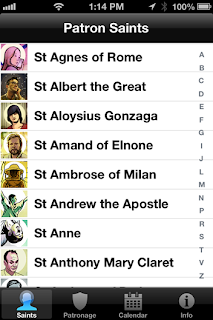
When you are bootstrapping something like this on your own, you savor the small victories. For me personally, it was a great learning experience in UI design. My own little victory was creating a very flat user experience, while still providing a lot of functionality. Our ability to implement these ideas was only possible because of the inimitable
Kaolin Fire, writer, developer and general creative mad man (and new daddy). Having great developers, and having a great relationship with them, is essential if you want to be able to try new ideas which require original code. Kaolin delivered far more value than we could afford to pay him for, partly because he's an awesome guy and partly because he's
interested in solving unique problems (ditto for Gary Amaro). This is the point at which I have to say, if you aren't curious, driven and just generally want to try to make awesome things, you are wasting your time by doing this kind of work. In the end, it shows in what you create. You also have to be resourceful. I taught myself how to design icons, three of the navigation bar icons shown above, I created. The only other option was to pay someone else to do the same thing.
Saintify's Social Solution
The other victory was creating a solution for sharing content across Facebook, Twitter and email, using the same content. That is no small deal, if you've navigated in these waters you will understand, and took a lot of thought and skill (and a brilliant coding solution by Kaolin). We ended up creating a social "card" for each patron saint, generated within the app, which allows users to share some of the original content within the app. The social card again required a lot of collaboration to make it work. Lesson learned? Things that appear simple, or obvious, usually required a lot of thought and effort to get there. And, help from talented friends like the designer Fiel Valdez, who is a master of elegant, understated design.
Sharing on Facebook
If anyone has any questions about the process, or would like for me to elaborate more on aspects of creating interactive content, feel free to email me directly or leave a comment. To manage this kind of project well, from creating wire frames to designing the app store listing and creating the necessary marketing materials, is a complicated undertaking. And, again, you really need to love the act of creating because the odds are slim that you will end up making a profit.


